You might just have noticed that we quite like color here. Actually, we're pretty obsessed with it in every last glorious hue; delicate to strong, cool to warm, light to dark, muted to bold and any other color-related scale of reference you can come up with.
But when we talk about a color as cool, light or muted, what exactly do we mean? I've put together a whistle stop masterclass in how color works and what that means for the colors you look and feel your best in.
Relative temperature
When we consider a color, the first thing we want to think about is its relative temperature.

In very basic terms, half of all colors are warm, and half are cool. But although this very basic color theory is a good place to start, we need to think about relative temperature, not just whether a color is yellow or blue or green. We know that the more yellow a color has in it, the warmer it is, the more blue it has, the cooler it is. So what happens when you add more yellow to that coolest of blues, for instance? Add enough and it will shift into being a warm shade. Make that yellow so sharp and acidic that it has lost all of its golden warmth, add a hint of blue to make it extra neon, and suddenly you're looking at a much cooler version of this warmest of shades.
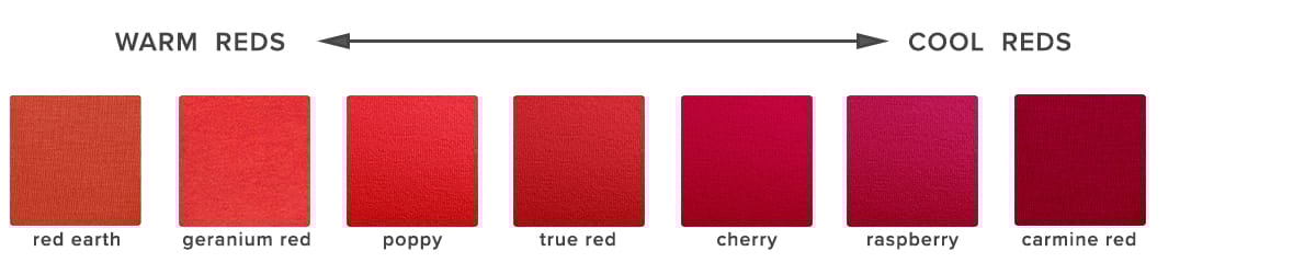
So when you're looking at color, think of its relative temperature, rather than just the basic color. Is it a red with more yellow, or more blue in? You'll soon notice that colors with a fairly equal balance (like teal, and many taupe shades) tend to fall somewhere in the middle, and will harmonise with almost any color as well as suiting a wide range of skintones. These are our universal colors at Kettlewell, and we love them as a first step into color for those who aren't sure what works for them.
Value
The second attribute of a color we need to consider is its value. This is a simple way of saying how dark or light it is. The more white a color has in its make up, the lighter it will be; more black means a deeper darker color.
Generally, the more depth of color you have in your natural coloring, the more depth of color you can take in your clothes (this is not an absolute rule, as we'll see in a moment when we come to consider contrast), but we have all seen, for instance, how harsh and stark black can look on someone with very pale hair, skin and eyes, compared to the elegant intensity it can have on someone with much deeper coloring.
As a general rule, as we age it becomes more challenging to wear the deepest colors within our palette. Black becomes harder and harder to pull off, and a deep grey or navy is likely to be much more flattering. More unexpectedly, a bold bright pink might be kinder than a heavy burgundy (on someone whose palette holds both of those colors), despite the brightness of the shade.
Brightness/Intensity
As well as depth of color, we want to think about how bright a color is. This means whether it is clear and bright, or has been muted down with the addition of grey.
Someone who suits clear, bright, fresh colors will look tired and dull in the more muted shades, whereas those bold shades will completely overwhelm someone who needs a softer look.
color analysis systems divide colors up into four seasonal palettes, two bright and two muted, but even within one palette there can be a surprising degree of shift from soft to bright - this reminds us that color is a spectrum rather than a set of four neat boxes.
Contrast
Contrast is the difference between colors we wear, or the difference between those colors and our own skintone, hair and eyes. It is so important in affecting how colors look, and applies within the contrast level between colors we wear, as well as their contrast with our own skin tone.
Different people will suit different levels of contrast - some people can go as extreme as true black and white, or hot pink and bright blue, while others look fabulous in a tonal outfit of mid-grey and denim blue. In the image above, Marija our summer model suits low contrast, so although she is wearing color, none of them are wildly stand out, rather the whole outfit is tonal and harmonious. Paula, on the other hand, suits color blocking and high contrast, and would look boring in a tonal muted outfit.
Even when it comes to your best colors, wearing them in a way which isn't your best in contrast terms can really impact how good they look. Someone who needs muted colors and low contrast, for instance, will look much more severe if they color block with only the lightest and darkest colors from their palette - this might only feel appropriate in an very formal environment (and might be even better with a slightly lower contrast equivalent), whereas someone who suits high contrast would look amazing in this combination for casual too.
Texture
Texture isn't exactly an aspect of color, but it's something that does affect the way we perceive it, so it's worth mentioning here. The more textured a fabric is, the softer and more muted a color looks. Smooth and shiny fabrics make the colors look instantly brighter.
An understanding of texture can be helpful if you're pushing the limits of your best colors. For someone who suits bright colors, for instance, a color that is at the very softest end of their personal palette will be much improved if it's in a silk or another somewhat light reflecting fabric, whereas that same color in suede or velvet might feel very drab and flat and like it belongs to another palette.
Which colors Are For Me?
And of course, the most important question of all is, which colors work for me? In the color analysis world, we divide up all colors according to the attributes above, and place them into four seasonal palettes, Spring, Summer, Autumn and Winter.
The seasons are each summarised below, but be aware these are just broad summaries - remember that color is a spectrum rather than four distinct categories, and there will be outliers within each season (for instance, you might be a Spring who suits the very lightest, softest and coolest end of your palette, but nonetheless are very much a Spring rather than a Summer). If you occasionally see a Kettlewell color and feel that it doesn't belong in your palette, it can be worth considering whether it falls at a different 'end' of the palette to the one where your skintone lives.
Autumn- warm, rich, muted colors. colors tend not to get too light, and Autumns usually suit a tonal look in mid-range to deeper colors.
Spring- warm, clear, bright colors, a light season on the whole. Reasonably high contrast although the colors never get as dark as black or true navy.
Summer - cool, soft, muted colors. colors can vary from very deep to very pale, but most Summers look best in more tonal outfits rather than pairing their lightest and deepest shades together.
Winter- cool, bright, high contrast colors. Winters usually look their best in looks which combine the very darkest and lightest colors in their palette, or neutrals with a splash of intense brightness, to give them that contrast that works so well.
If you want to discover which palette of colors belongs to you - whether you need bright or soft, warm or cool, high or low contrast - then our color quiz is a great place to start. And if you want more information, you can get a definitive answer by booking a personal color analysis; you can find a color stylist here.



Your Color Masterclass
You might just have noticed that we quite like color here. Actually, we're pretty obsessed with it in every last glorious hue; delicate to strong, cool to warm, light to dark, muted to bold and any other color-related scale of reference you can come up with.
But when we talk about a color as cool, light or muted, what exactly do we mean? I've put together a whistle stop masterclass in how color works and what that means for the colors you look and feel your best in.
Relative temperature
When we consider a color, the first thing we want to think about is its relative temperature.
In very basic terms, half of all colors are warm, and half are cool. But although this very basic color theory is a good place to start, we need to think about relative temperature, not just whether a color is yellow or blue or green. We know that the more yellow a color has in it, the warmer it is, the more blue it has, the cooler it is. So what happens when you add more yellow to that coolest of blues, for instance? Add enough and it will shift into being a warm shade. Make that yellow so sharp and acidic that it has lost all of its golden warmth, add a hint of blue to make it extra neon, and suddenly you're looking at a much cooler version of this warmest of shades.
So when you're looking at color, think of its relative temperature, rather than just the basic color. Is it a red with more yellow, or more blue in? You'll soon notice that colors with a fairly equal balance (like teal, and many taupe shades) tend to fall somewhere in the middle, and will harmonise with almost any color as well as suiting a wide range of skintones. These are our universal colors at Kettlewell, and we love them as a first step into color for those who aren't sure what works for them.
Value
The second attribute of a color we need to consider is its value. This is a simple way of saying how dark or light it is. The more white a color has in its make up, the lighter it will be; more black means a deeper darker color.
Generally, the more depth of color you have in your natural coloring, the more depth of color you can take in your clothes (this is not an absolute rule, as we'll see in a moment when we come to consider contrast), but we have all seen, for instance, how harsh and stark black can look on someone with very pale hair, skin and eyes, compared to the elegant intensity it can have on someone with much deeper coloring.
As a general rule, as we age it becomes more challenging to wear the deepest colors within our palette. Black becomes harder and harder to pull off, and a deep grey or navy is likely to be much more flattering. More unexpectedly, a bold bright pink might be kinder than a heavy burgundy (on someone whose palette holds both of those colors), despite the brightness of the shade.
Brightness/Intensity
As well as depth of color, we want to think about how bright a color is. This means whether it is clear and bright, or has been muted down with the addition of grey.
Someone who suits clear, bright, fresh colors will look tired and dull in the more muted shades, whereas those bold shades will completely overwhelm someone who needs a softer look.
color analysis systems divide colors up into four seasonal palettes, two bright and two muted, but even within one palette there can be a surprising degree of shift from soft to bright - this reminds us that color is a spectrum rather than a set of four neat boxes.
Contrast
Contrast is the difference between colors we wear, or the difference between those colors and our own skintone, hair and eyes. It is so important in affecting how colors look, and applies within the contrast level between colors we wear, as well as their contrast with our own skin tone.
Different people will suit different levels of contrast - some people can go as extreme as true black and white, or hot pink and bright blue, while others look fabulous in a tonal outfit of mid-grey and denim blue. In the image above, Marija our summer model suits low contrast, so although she is wearing color, none of them are wildly stand out, rather the whole outfit is tonal and harmonious. Paula, on the other hand, suits color blocking and high contrast, and would look boring in a tonal muted outfit.
Even when it comes to your best colors, wearing them in a way which isn't your best in contrast terms can really impact how good they look. Someone who needs muted colors and low contrast, for instance, will look much more severe if they color block with only the lightest and darkest colors from their palette - this might only feel appropriate in an very formal environment (and might be even better with a slightly lower contrast equivalent), whereas someone who suits high contrast would look amazing in this combination for casual too.
Texture
Texture isn't exactly an aspect of color, but it's something that does affect the way we perceive it, so it's worth mentioning here. The more textured a fabric is, the softer and more muted a color looks. Smooth and shiny fabrics make the colors look instantly brighter.
An understanding of texture can be helpful if you're pushing the limits of your best colors. For someone who suits bright colors, for instance, a color that is at the very softest end of their personal palette will be much improved if it's in a silk or another somewhat light reflecting fabric, whereas that same color in suede or velvet might feel very drab and flat and like it belongs to another palette.
Which colors Are For Me?
And of course, the most important question of all is, which colors work for me? In the color analysis world, we divide up all colors according to the attributes above, and place them into four seasonal palettes, Spring, Summer, Autumn and Winter.
The seasons are each summarised below, but be aware these are just broad summaries - remember that color is a spectrum rather than four distinct categories, and there will be outliers within each season (for instance, you might be a Spring who suits the very lightest, softest and coolest end of your palette, but nonetheless are very much a Spring rather than a Summer). If you occasionally see a Kettlewell color and feel that it doesn't belong in your palette, it can be worth considering whether it falls at a different 'end' of the palette to the one where your skintone lives.
Autumn- warm, rich, muted colors. colors tend not to get too light, and Autumns usually suit a tonal look in mid-range to deeper colors.
Spring- warm, clear, bright colors, a light season on the whole. Reasonably high contrast although the colors never get as dark as black or true navy.
Summer - cool, soft, muted colors. colors can vary from very deep to very pale, but most Summers look best in more tonal outfits rather than pairing their lightest and deepest shades together.
Winter- cool, bright, high contrast colors. Winters usually look their best in looks which combine the very darkest and lightest colors in their palette, or neutrals with a splash of intense brightness, to give them that contrast that works so well.
If you want to discover which palette of colors belongs to you - whether you need bright or soft, warm or cool, high or low contrast - then our color quiz is a great place to start. And if you want more information, you can get a definitive answer by booking a personal color analysis; you can find a color stylist here.